Reporting & Analytics
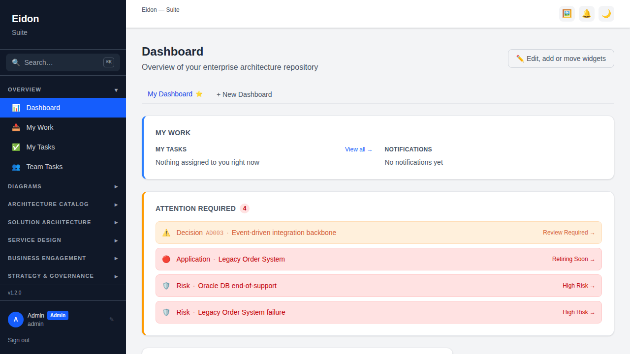
Dashboard
The landing overview: entity counts, lifecycle/maturity distributions, and risk/decision alerts, with drag-to-customise widgets. Which widgets appear (and which module's data they surface) is seeded automatically from your workspace's edition and your role, so an SA-only workspace's dashboard leans on Solution Design widgets rather than empty EA-catalog tiles.
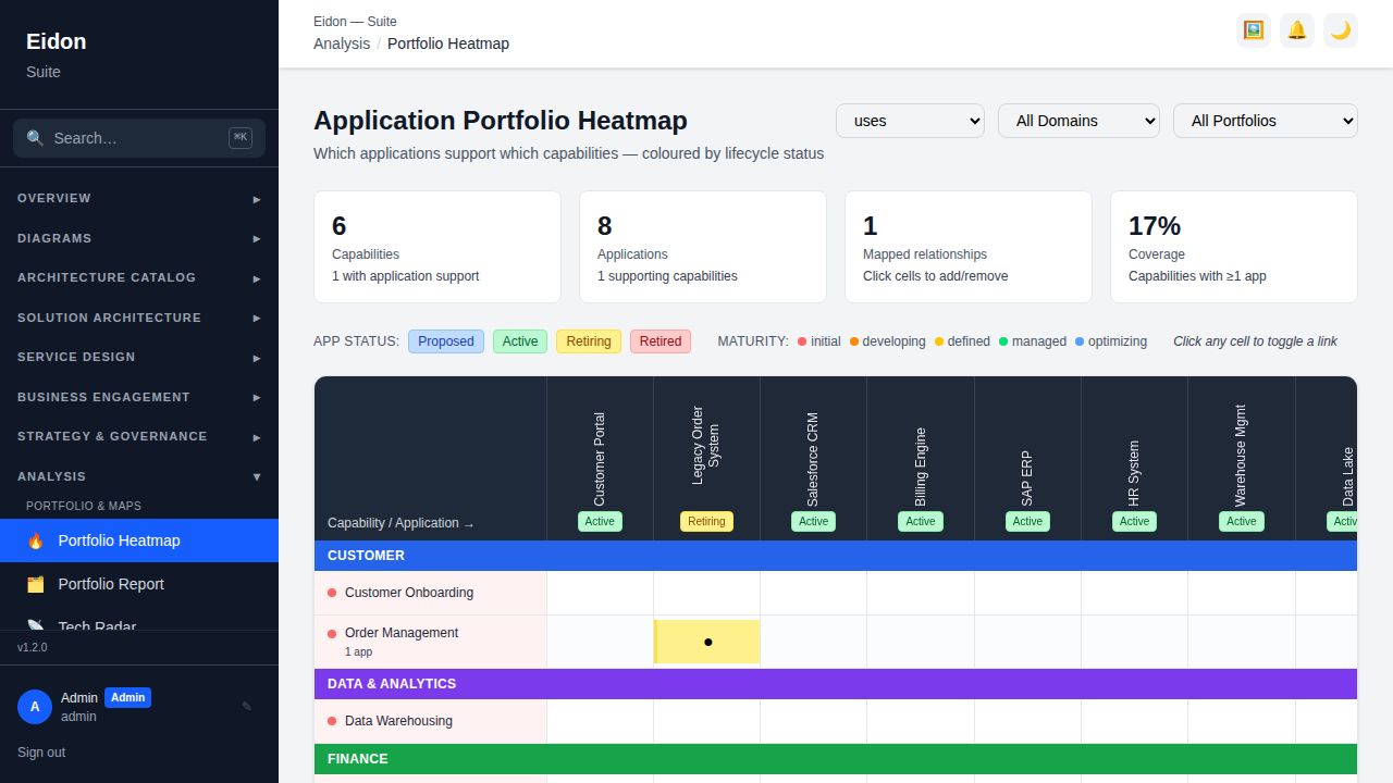
Portfolio Heatmap
A Capability × Application coverage matrix — click a cell to create or remove a link between the two directly from the grid, without navigating to either record. Densely covered rows/columns show which capabilities are over-served by applications (rationalisation candidates) and which are thin (investment candidates).
Pivot Report
An ad-hoc cross-tab: pick a catalog entity type (Applications, Capabilities, Technologies, Data Assets), then any two of its attributes for rows and columns — e.g. Applications by Lifecycle Status × Business Criticality — and get a count matrix with row/column totals, generated on the fly rather than needing a purpose-built report for every combination. The Portfolio Heatmap remains the dedicated Capability × Application coverage view; this is for everything else.
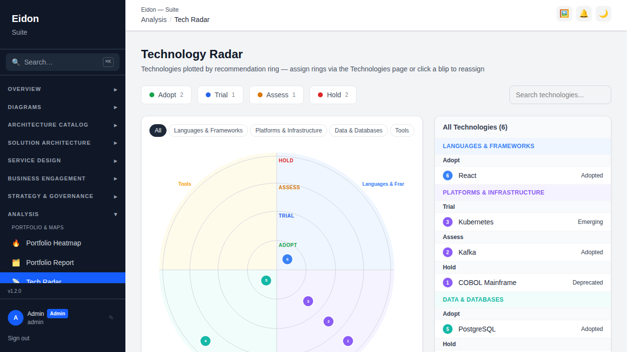
Tech Radar
Plots technologies into 4 quadrants × 4 rings (Adopt/Trial/Assess/Hold), set explicitly or derived from lifecycle status and end-of-life proximity — the same visual format popularised by ThoughtWorks' technology radar, applied to your own live technology inventory instead of an industry-wide one.
Cost & TCO
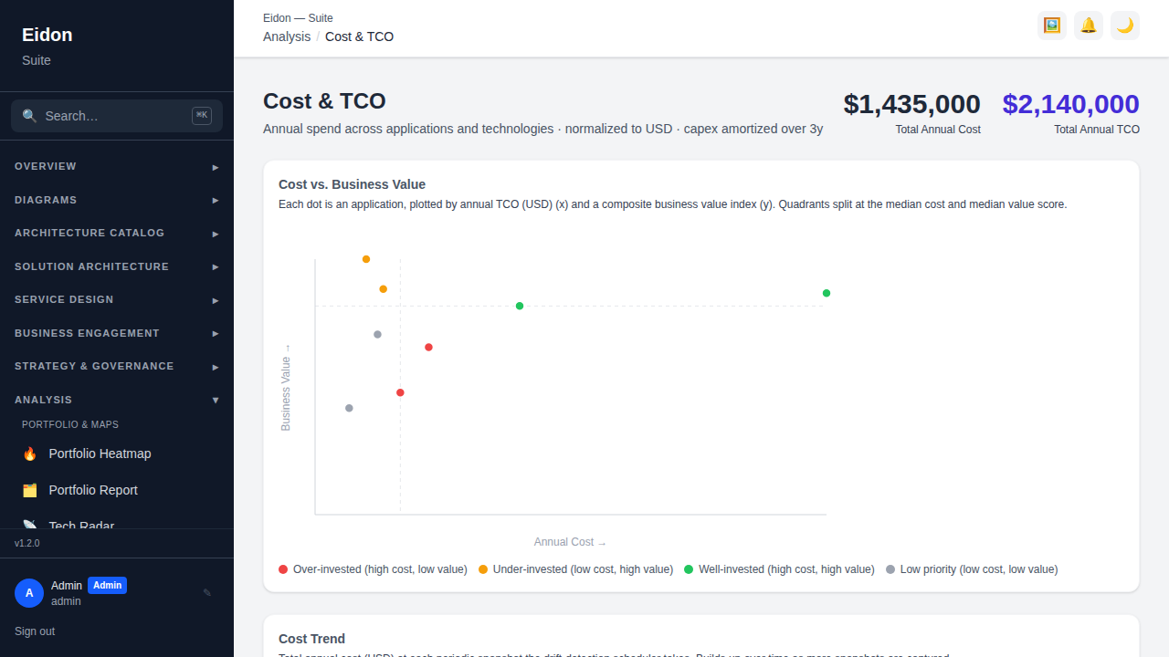
Reports annual cost and total cost of ownership for applications and technologies, broken down by vendor and licence type, drawing on the same contract and cost fields captured on each record's detail page — so cost reporting doesn't require a separate spreadsheet exercise once the underlying data is entered once.
Gap Analysis
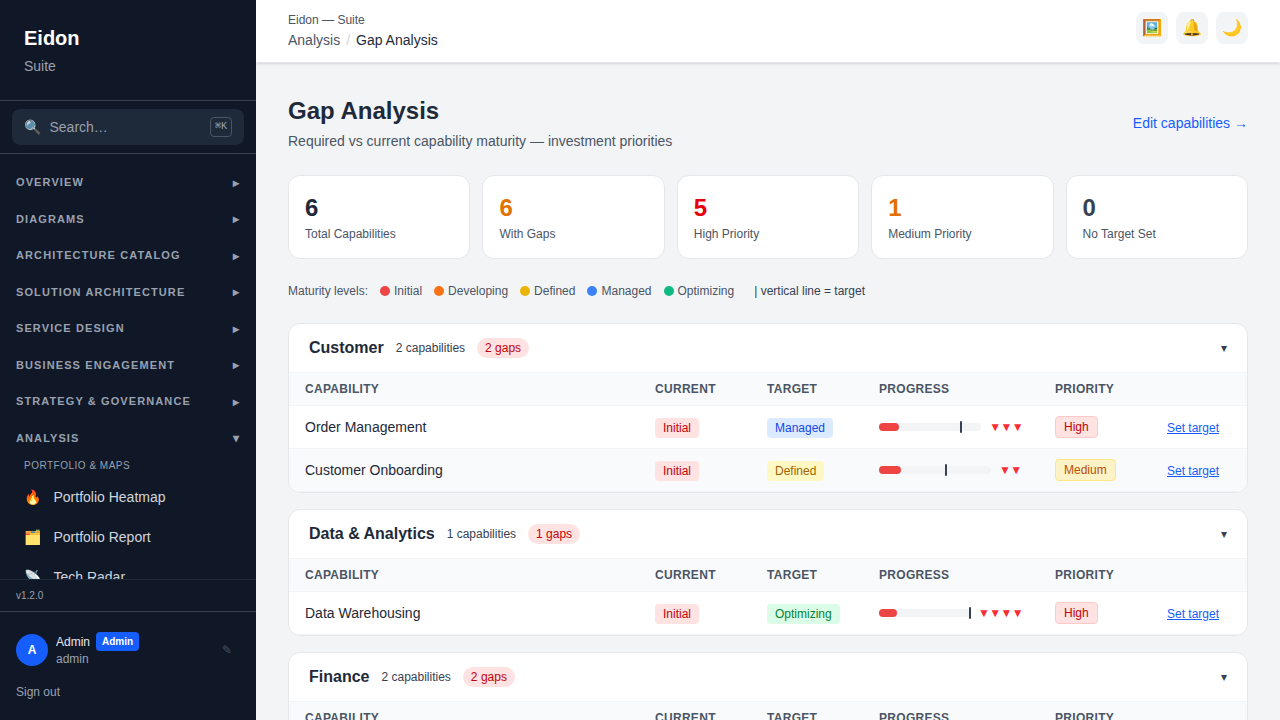
Compares each capability's current maturity to its target and computes a gap and priority (High/Medium/Low), turning the maturity ratings captured on Capabilities into a ranked to-do list of where investment is most overdue.
Change Impact
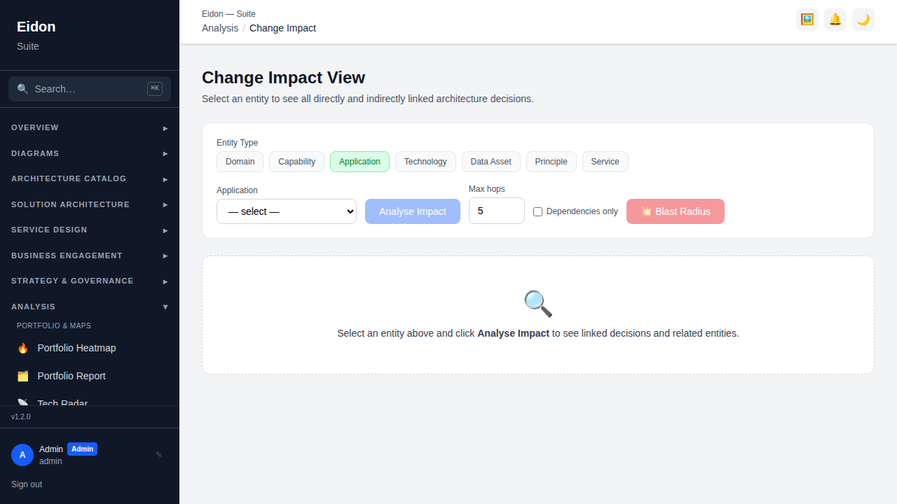
Traces decisions and related entities one hop out from a selected entity, answering "what else is touched if this changes" before a change is committed to.
Capability Maturity
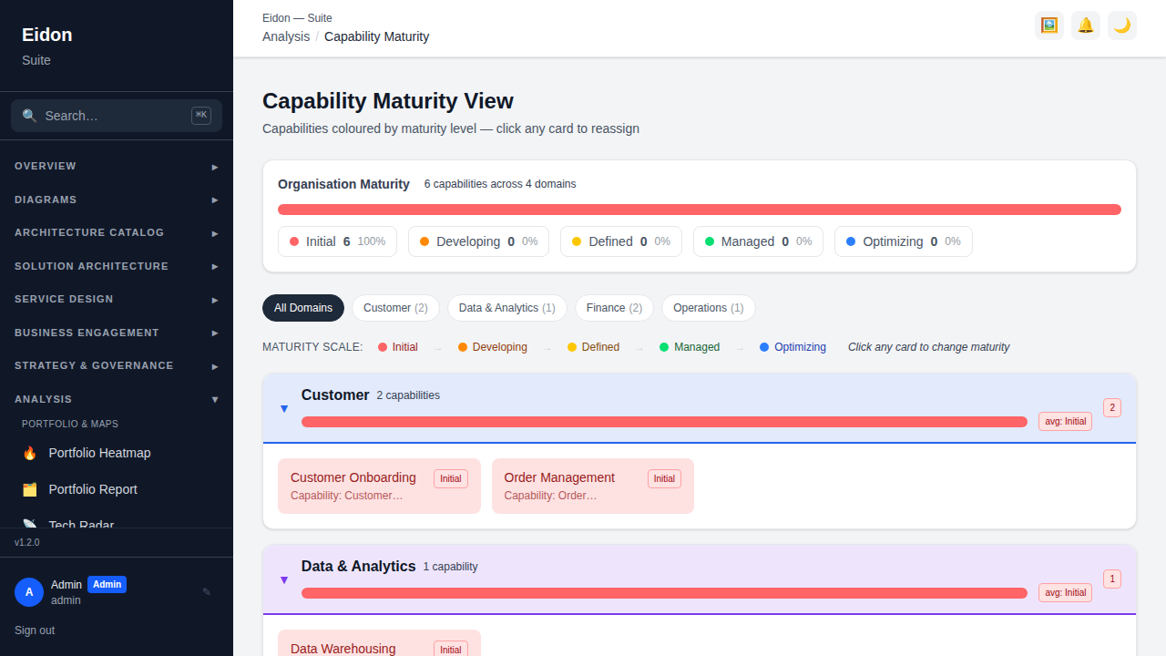
Shows a hierarchical maturity tree per domain with inline editing and risk badges, so current and target maturity can be updated directly from the tree view rather than opening each capability's detail page individually.
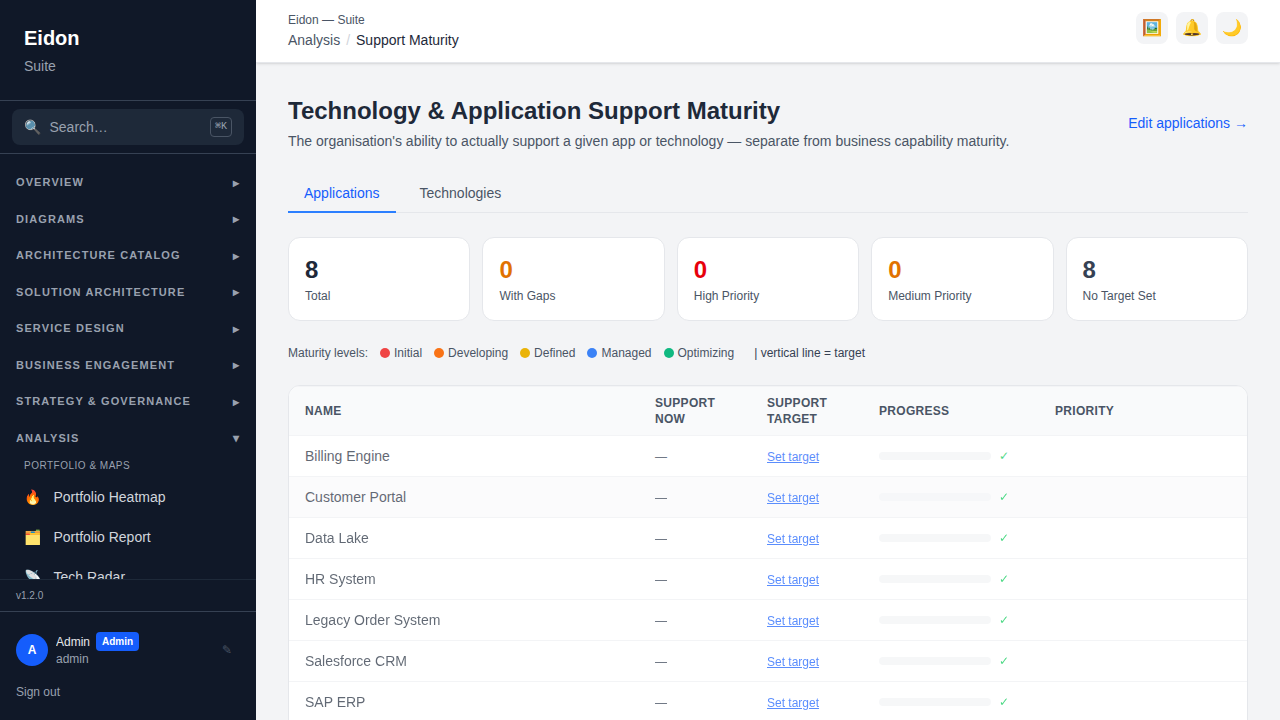
Support Maturity
Applies the same current-vs-target maturity model as Capability Maturity, but to operational/support readiness for Applications and Technologies (separate tabs) rather than business capability — showing the gap and a priority flag, with inline editing of both current and target levels.
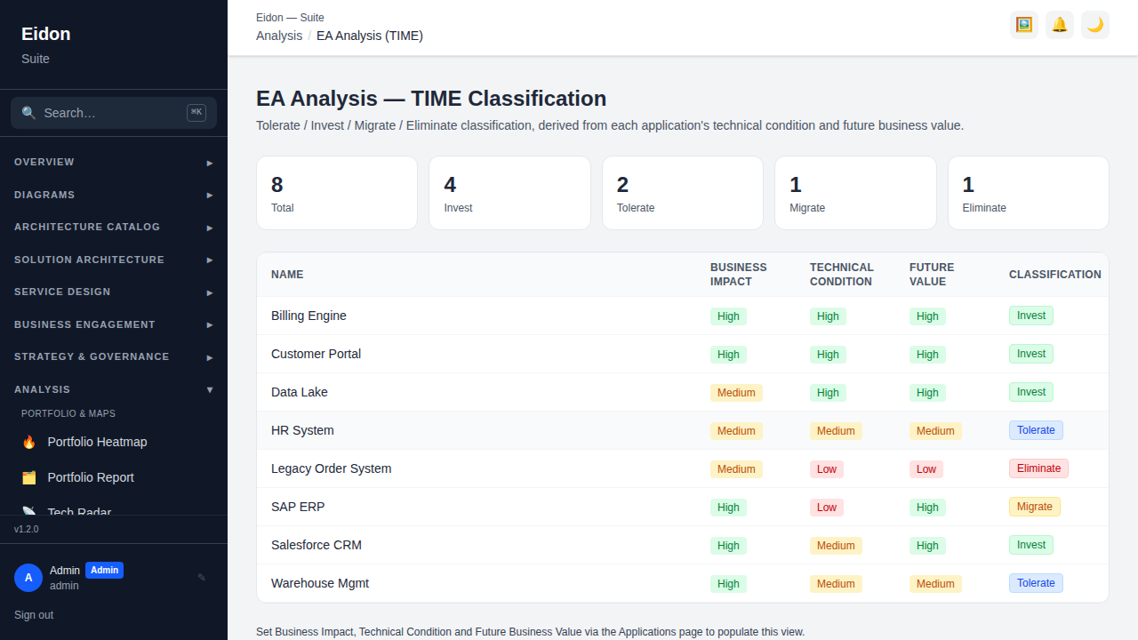
EA Analysis (TIME)
Classifies applications into Tolerate / Invest / Migrate / Eliminate quadrants from their Technical Condition × Future Business Value ratings — a standard EA portfolio-rationalisation framework, and the same classification Analysis → Rationalization turns into a tracked, ownable decision.
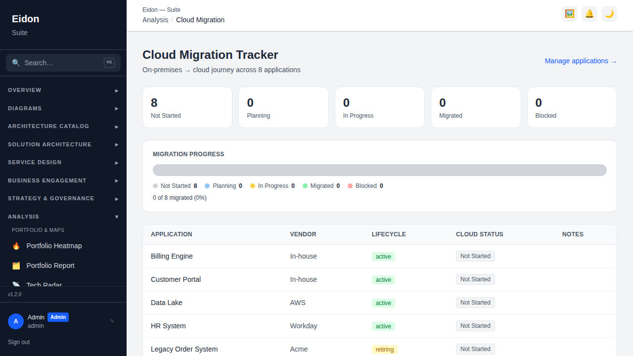
Cloud Migration
Tracks each application's migration status (Not Started/Planning/In Progress/Migrated/Blocked); setting "Blocked" requires a written justification, so a stalled migration always has a recorded reason rather than silently sitting unexplained.
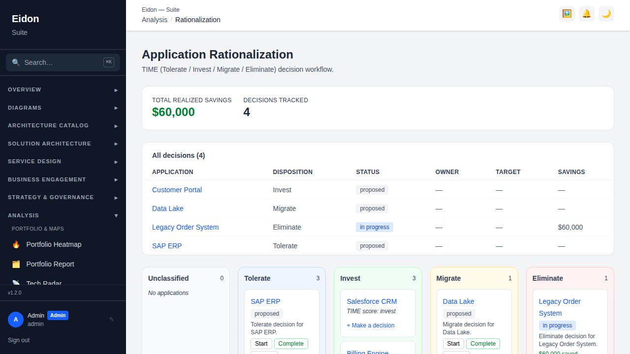
Application Rationalization
Turns a TIME classification into a tracked decision workflow: a Kanban board of applications by disposition (Unclassified/Tolerate/Invest/Migrate/Eliminate), where any application can have a decision recorded against it — rationale, owner, target date, and eventual realised savings once executed — moving through proposed → in_progress → completed/cancelled. A savings rollup at the top totals realised savings across every completed decision, turning rationalisation from a one-off analysis exercise into an ongoing, accountable programme.
An AI Suggestions panel (requires AI configured for the workspace — see Settings → AI) proposes a TIME disposition and flags cost-saving candidates for applications that don't yet have one and aren't already mid-decision, with a confidence level and short rationale for each. Suggestions are advisory only — nothing is recorded until you turn one into a decision through the same form the board itself uses.
Change Calendar
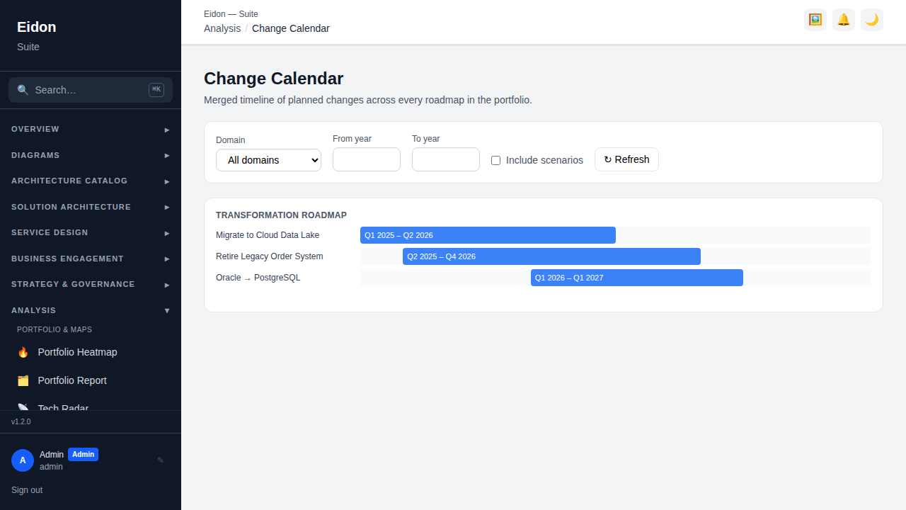
A merged timeline of planned changes across every roadmap in the portfolio, grouped by roadmap and rendered as quarter-scaled bars with a filterable domain and year range; an "include scenarios" toggle optionally overlays speculative/what-if roadmap variants alongside the committed ones, so you can see how a proposed scenario would reshape the overall change calendar before committing to it.
Architecture Fitness
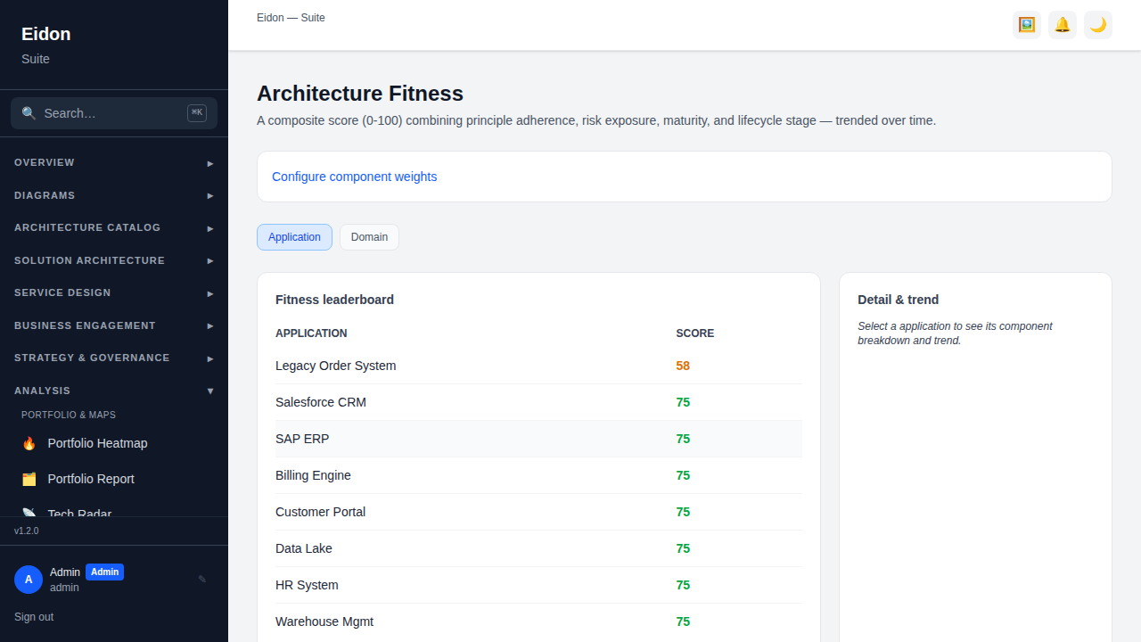
A leaderboard scoring each application 0–100 on a composite "fitness" measure (sub-scores plus a trend sparkline over time), surfacing which systems are healthiest vs. which need attention. Admins can open "Configure component weights" to change how much each sub-score contributes to the overall score — the only report page with its own admin-only control.
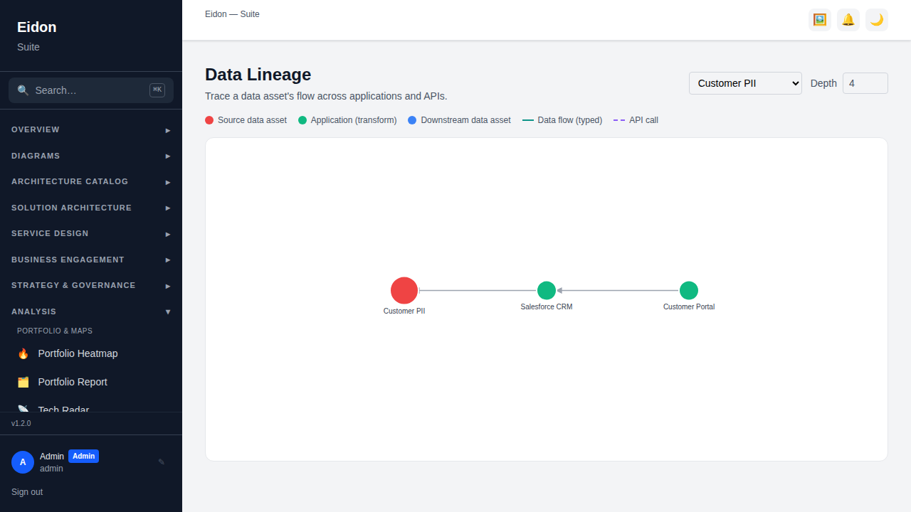
Data Lineage
Pick any data asset and a traversal depth (1–8 hops) to render its forward lineage — which systems it flows into, including flows discovered via API producer/consumer links — so you can answer "if this data asset changes, what's downstream?"